Thursday, February 20, 2014

Elissa Art

Getting psyched for sailing next month!  I'm assigned to the main mast for two daysails and one overnight (actually, it's two nights at sea following one at dock, so it's more of a cruise, really.  Except I'm "working.") Woo!

I'm doing this illustration as a sort of commemorative souvenir for this year's crew.  It's not the first tall ship I've ever drawn/painted, but it is the fist one that is even close to accurate.

I did this "naked" version first, which is just the ship without any sails, which I enjoy because it shows the rigging much better.  I'm just now realizing that I forgot the anchor!  I had intended to put that in there...it's also (intentionally) missing all its brace bumpkins, foot ropes and crainl'ns...probably a few other important aspects, but, eh...maybe I'll add some of that later, maybe I won't.
My favorite thing to do nowadays is climb over the crosstrees.  That's the second little platform on the fore or main mast--where it's wood colored, not white.  The lower platform is called "the tops", confusingly but for a very good reason once you know what it is.   

Thursday, February 6, 2014

Illustration Friday 2/31/14

topic: Exotic
Nothing much to say about this one...pretty straightforward, really.  I took a bunch of photos one time when I visited the Jacksonville Zoo, and the point of zoos (at least at their inception) is to bring "exotic" animals before a local audience.

I remember this little guy was doing a good job distracting me from the GIGANTIC boa constrictor that was slowly, oh, so, slowly, mauling a plump white rat in the opposite corner of the reptile house.  No, who am I kidding...NOTHING could distract me from that.  Could...not...tear...eyes...away....

So this dude was looking pretty friendly.  Sorry, snakeophiles, I don't remember what kind it was.

Wednesday, January 15, 2014

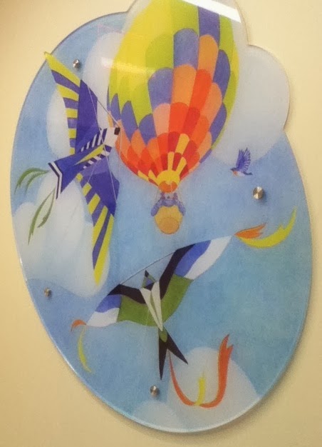
Florida Skies (Hospital art installations, pt. 2)

The ribbon cutting ceremony for the new pediatric Congenital Heart Center at Shands was last week I'm so pleased with the way it all came together.  The theme, again, was "Florida Skies," and these funky floors were the basis for the images I did, seen here printed on large slabs of clear acrylic--a very cool method of displaying art in a hospital, when you think about it.  I did a set of four images that were printed and installed the same way in 2012 for the Pediatric outpatient clinic, and I've been really impressed with the quality of the work that this Gainesville print company does.  

In this slideshow from the local newspaper, and this short promo video, you can see a bit more of the unit, including the lovely mosaic work of one of my dear friends.   Overall, the team of people designing the physical space and visual experience in this hospital are just awesome.  It really helps that the Arts in Medicine program is so fully integrated into the hospital's mission and goals. 


The same print shop also printed my sun and moon decals that decorate the soffits in the patient rooms. 


The artistic experience won't stop with the walls and the floors; patients will be immersed in creative activities as much as possible while receiving care, as part of their whole-person treatment at Shands.  I just hope that soon, every major hospital will support a similar program and embrace this approach.

Thursday, January 9, 2014

Illustration Friday 12/27/13

topic: Reflect
First I.F. of the year...well actually it's from the previous week, ergo it's from last year, but due to confusing wording in the newsletter that went out on January 3rd, I mistakenly thought this was the current topic.  The actual topic for this week was, ironically, Time. Seeing as it's now Thursday afternoon, I don't think there is enough of it to spare for a do-over.

I try not to do the first thing that comes to mind for any project.  For this topic, the fist association was, naturally, a mirror.  (Most reflective thing, I guess?)  I wasn't about to do one of those Art 101 curved metallic and glass surfaces technical drawings because...WHY??  Would anyone. Do that to themselves.   Sorry guys, they aren't any more fun to do than they are to look at.  

But then an image popped into my head from a long-forgotten story that I just could not remember anything else about.  The image was of a child walking across the reflection of the moon's light on the ocean's surface.   He actually walks all the way to the moon in this manner.  Anyone  have a guess?  No?

Thanks to Google, I eventually figured out that the story was called The Garden Behind the Moon and it was by none other than Howard Pyle, the father of American illustration himself.  Turns out I had actually first encountered the story while working the cash register at an art supplies store (that also sold books.)  Cashiering was obviously not requiring 100% of my mental faculties or attention that day, so I grabbed a book from one of the shelves because it had a winged horse on the cover and read it.  (Come to think of it, I still can't remember how the winged horse comes into play.)  Anyway, upon a quick read-through of the synopsis on Amazon, I remembered that the moonlight bridge, which happens in the first chapter, was the visual highlight of the story for me, and the rest was really boring in the way that only children's stories published in 1903 are.  (There is a nice bit where he has to polish stars with lamb's wool, but Mr. Pyle sort of did the definitive rendition of that scene himself for the book.)

So back to I.F.--I decided to go with the original imagery of moonlight reflecting on the water that sparked my memory, but skipped the supernatural stuff, planting my lovely tall ship there instead.  

As a heads-up, you might be seeing an increase in tall ships in my work over the coming year, now that I'm a sailor on one. 

Wednesday, October 2, 2013

Florida Skies Preview (Hospital Art Installations, Pt. 1)

The theme for the project I'm currently working on is "Florida Skies" and it's really quite rad. It involves multiple stages, various facets and all kinds of interesting challenges.  In other words, its good work!  Thank you Shands Healthcare for being awesome to work for, even when I'm not on site anymore.

As *part* of the project, these little guys will be greeting you at the entrance to the new Pediatric Cardiac Intensive Care unit.  The installation method is going to be unique to say the least.  I get to oversee it, kind of, from afar.  Let's just say I'm glad I won't have to be one of the guys hauling 4-ft long, irregular-shaped, 3/4" thick glass up to the 10th floor.

I'm so lucky to have met and worked with such awesome people back in Gainesville.  The director of the Arts in Medicine program, whose also has the separate job of making the hospital environment as visually warm, inviting and hope-inspiring a pace as possible, somehow saw fit not only to contract me as an Artist in Residence back in the fall of 2008, when I didn't know what the heck I was doing with my career, then to encourage me to explore all the various nooks and crannies of possibilities within that post, she's now brought me on board several times to help with environmental design aspect.  Who knew?  And yet I love it.

I know the work I'm doing for this project isn't conceptually deep.  I could write a thesis on the distinctions between High Art and art as approachable commodity, all the interesting levels in between, and the appropriateness of each in various settings.  But I have to assume it's somewhat obvious in this context.  The psychological aspect is the setting itself, where certain imagery that feels safe and comforting--and is universal, might actually improve the overall experience, even if only subconsciously and only slightly, of, say, a kid whose sibling is about to undergo open heart surgery that they can barely understand.

I love that the theme for this unit is birds and suns and clouds and things that fly.  It's tempting to say that I got that proverbial, elusive creative job where the sky, literally, is the limit.  As in, I'm limited to things that are in the sky.  But it's a good place to be (provided you're not afraid of heights...) After getting the layout of the unit and the locations where my images would be installed, I came up with some vague idea about a baby bird, looking out wistfully over the edge of the nest, at the adjacent wall where the adult birds are flying in graceful swooping arcs.  Is he dreaming of his own potential?  Is he the child in the hospital?  Is he the helpless parent or the determined caregiver? Is he the embodiment of hope itself?  That's about as deep as it will get, but in this particular context, I think that'll do.


Saturday, September 21, 2013

Galveston is Hung...er, Hanged?


After a minor delay, the work for the show entitled "Galveston Hangs" is now up on the outside of the historical First National Bank building on the Strand.  The murals are hanging in all of the street-level windows, going around the corner as well.  There was some pretty cool work there, and the hubby and I had fun at the reception shmoozing with the other artists and a few other random men and women about town.  All in all it was a good turnout, even with a light rainfall.  I was happy to have contributed, but, alas, I don't think I'll be donating anything this large again.

The truth is I would normally rail against this kind of solicitation of free work, and perhaps I should have in this case as well.  In this particular instance, the "exposure" seemed unusually good--it is along the main drag in the city--where all the art galleries and boutiques and such are located, and hence, hopefully, where people who buy art will notice it.  I must confess I was also trying to build a good working relationship with this organization because of what I hope we will be able do for each other's mutual interests in the near future.  Will they see it that way, I wonder?

Time will tell if this was a good investment or not, but in the end, I may only have bought myself the right to point down the road and say, "my work is up there." So, I will be pulling on my business owner's hat to the next folks who "just love" my work:  please get in line, and try to have your checkbook in hand.

Thursday, August 29, 2013

"Galveston Hangs" Preview


I snapped these photos of the work-in-progress a few days ago, so it's rather further-along now, but I don't want to give too much away before the official opening of the show next Saturday.  As you can see, I'm using a Reyna color palette.The task at hand is to create a mural depicting "what Galveston means to me."                                                                                                       Based on my having lived here for all of four months, (and in all honesty--still not totally sold...there was some really nasty black, tarry crudd washing up on the beach yesterday,) I decided to focus more broadly on what community means to me.  
My mural will depict ways I enjoy participating in my community, such as getting books from the library, biking, growing a garden, and buying food at the local farmer's market.  All these things have been important and satisfying to me in each place I've lived, from Wisconsin to Savannah to Florida, and now here.  If I have to give it a title, I might call it, "a place to grow."

To be honest, I'm still wishing for a nice shady bike path around here, or even a safe commute to downtown. The locals keep telling me Galveston is a GREAT place to bike--they just do it on the streets, in the blazing sun, around the ubiquitous both-sides-of-the-street-parking, I guess.  

I was invited by a fellow Galveston Hangs artist to go on a ride last week, but unfortunately I was too busy painting this mural!  As soon as it and the Shands project are done, I will try it out.  Until then, my painting, as it does so often, will portray my idealized world. 

(Cos my tomatoes were never that bountiful!)   

Thursday, August 22, 2013

Getting Intimate with a Sheet of Plywood

Ah, the process.

I'm commencing work on the 8x2 foot panel for the Galveston Arts Center.  By panel, of course, I mean rough plywood, which was donated by a local construction company for the exhibit, which was very cool and generous, but wow...

It ain't pretty, but it's what I have to work with. Thank goodness I own a power sander!

For those who missed the Facebook Post, it's going up on a window of a beautiful building on the Strand (the historic downtown district in Galveston) for about a month or so.  It's part of a large, sponsored outdoor art show curated by GAC to raise funds to complete the restoration of the building.


Hopefully I can finish with the spackle and primer tomorrow and get some solid sketches done in time for a weekend of fun!*

*By which I mean work.

Friday, June 21, 2013

Etsy Shop

My Etsy Shop is now open!  Wow, does that take a lot of time, between sizing and formatting the images to figuring out all the shipping costs...I will absolutely have to keep adding more items to make it worth my while.  

The artwork for sale includes a lot of stuff that doesn't feel appropriate on my illustration portfolio site--experimental techniques, painted objects, etc.  I'm waffling between keeping a separate Etsy account for my professional work only, but I don't know if it's worth the hassle of creating another shop and managing two different things that I can't be signed into at the same time. I guess I'll see how this goes for a while.

Oh, for those who don't know or just don't get it, the shop's name (Laurel Crayon) is an anagram of my name.  It's how I derived my logo, back in art school.  I still like it, so, it stays.

I did notice that someone favorited one of my items already, so that's cool! 

https://www.etsy.com/shop/LaurelCrayon


If your item is small, like a keychain fob, it will come wrapped like this.  Thanks to one of my former Arts in Medicine volunteers for giving me the idea:)

Thursday, June 6, 2013

Finishing (continued from last post)


Step 8: Re-draw the image full-size on cheap copy paper. (I tape sheets together if one isn't big enough.)  Sometimes I enlarge and trace my thumbnail, sometimes I use an intermediary sketch (like when the client needs to see the sketch, I do a prettier one for them).  Either way, any number of departures are made at this stage; this is where I really make use of my reference material if I need to. (Is that hair ornament the right one for the time period? Do people's elbows really bend that way? Is this linear perspective believable?) Erase and revise with abandon.


Ready to paint!
Step 9: Prepare the final surface.  When I work in watercolor or other semi-transparent media, I don't want any eraser marks on my final piece.  So this step is just where I lightly trace the finalized step 8 (without all its messy mistakes) onto my watercolor paper.  I have a 16x18" light box for this process, which helps a lot. Then, if it's large, I wet the paper and stretch it onto a piece of plywood or thick foam board and let it dry nice and tight to prevent warping.  Any pencil marks on the paper before this step will get sealed in, so they won't smudge.


Step 10: Painting! All the decision-making and hard work is done; now it's time to just relax and color.  For this set, I did a light wash of color over the whole paper first, which can help keep the colors harmonious, but isn't good if you want a true, transparent watercolor look.  

I paint backgrounds first and figures last; I have a tendency to go too light on the figures if I paint them against a white background. They probably taught me that in art school, but I had to do it wrong a bunch of times before it sank in.


I come back afterwards and do some clean up with ink, pencil, or more opaque paint and a tiny brush. I'll darken, highlight or define certain areas using my references as a guide if I have them.  (In this case I didn't use much direct reference--I only had a day to paint each of these, so the people and settings are basically made-up after glancing at some pictures.)  


As soon as it's dry I pull off any tape, staples, etc., sign it, photograph or scan it, file it, package or frame it and get it where it needs to go on time.  

Have a creative and productive work day!

Update: All four finished paintings have now been sold.  If you would like to commission similar ones, please let me know!